Web Development & Design
QR Codes Your Customers Will Actually Scan
QR codes are everywhere now: menus, posters, receipts, shop windows. Most of them work. A depressing number do not, and the reasons are always the same handful of avoidable mistakes. A code that fails to scan is worse than no code at all. It trains customers to ignore the next one too. Here is how to make codes that scan the first time, plus when to skip them entirely.
Short content scans best
A QR code stores your text as a grid of squares, and longer text means a denser grid. Dense grids need bigger prints, better cameras, and steadier hands. A short link scans from across the room. A 500-character paragraph encoded raw needs ideal light and patience nobody has.
So the first rule is to encode as little as possible. Link to a page instead of embedding the menu itself. Use a short URL rather than one with tracking parameters trailing behind it. If the code looks dense and busy, with tiny crowded squares, shorten the content before you enlarge the print. Size compensates for density, but brevity fixes it.
Contrast and quiet zones are non-negotiable
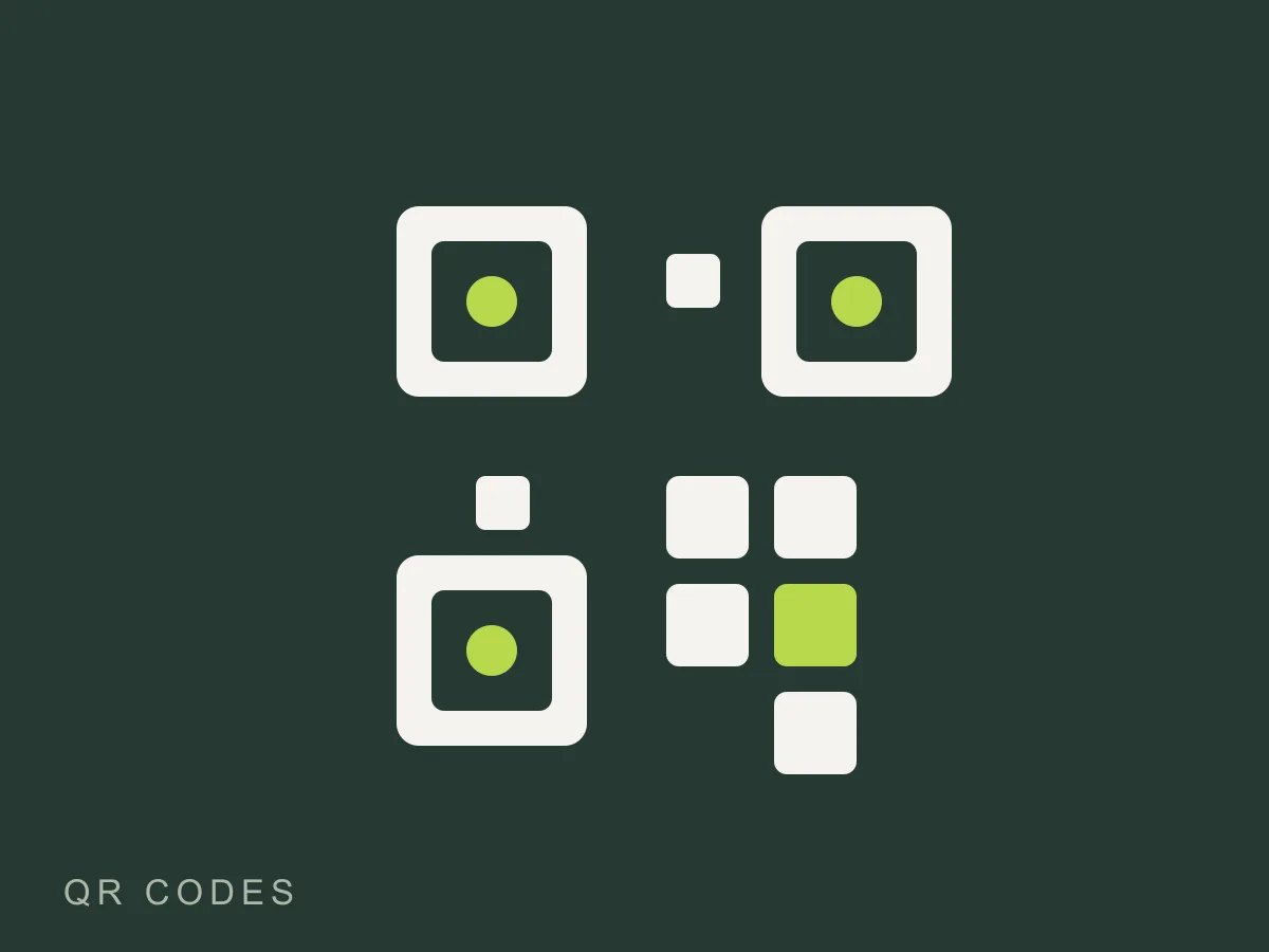
Phone cameras find codes by spotting three square markers in the corners. Anything that confuses that hunt kills the scan. Dark modules on a light background work everywhere. Inverted codes, light on dark, fail on many phones, so skip the stylish inverted version no matter how good it looks in the design file. Busy backgrounds behind the code are equally fatal. Give every code a clean white margin, the quiet zone, at least as wide as a few modules on all sides. That empty border is part of the code, not decoration around it.
Size follows a simple rule of thumb. A code people scan from arm's length needs to be at least 2 centimeters square in print. Billboards and banners scale up from there: roughly a tenth of the viewing distance. When in doubt, print one copy at real size and test it with two different phones, one old and one new, before printing five hundred.
Damage resistance, explained without mystique
Every generator offers an error correction setting, usually labeled L, M, Q, H. It controls how much of the code can be scratched, dirty, or covered while still scanning. Higher settings bloat the code, so match the setting to the environment. A menu shown on a clean phone screen is fine on low. A sticker on outdoor equipment or a flyer that lives in pockets wants high. Medium covers most indoor printing and is the sane default.
Physical placement matters as much as settings. Codes at knee height get ignored. Codes behind glass reflect camera flashes back at the lens. Codes on curved cups distort past readability. Walk the customer's path yourself, phone in hand, and scan every code in place before launch day.
When not to use one
Codes are a bridge from paper to screen, nothing more. If the customer is already on their phone, a button beats a code they would have to screenshot and scan with a second device. If the destination is your homepage, print the address instead. And never make the code the only path to something essential like tickets or payment. Phones die, cameras crack, apps glitch. The code is a convenience layered over a process that works without it.
Make one in seconds
Our free QR code generator draws the code entirely in your browser: type text or a link, pick a size up to print-ready 1024 pixels, choose the damage resistance, download the PNG. Test the download with your own camera before it goes anywhere public. That thirty-second test catches nearly every failure on this page.
Keep reading